Simplifying my blog and achieving perfect lighthouse score
New design
I have decided to change the design of the blog, aiming for maximum simplicity. In this change, I switched from using WordPress to using Hugo as a platform. This way, I don’t have to worry about security updates, database maintenance, etc… which in practice didn’t take up much of my time, but it’s one less cognitive load. It simplifies several things for me, although I understand it’s not for everyone.
I will probably unify the posts from codigomanso.com into this blog, so I’ll have one less thing to worry about, we’ll see.
I chose a minimalist design, where the content is king. Everything else is out.
When creating the new design, I based it on an existing Hugo template (archie), although I adapted it to my tastes and needs.
Achieving a Perfect Lighthouse Score
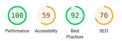
I like challenges, so aiming for minimalism, I set out to achieve a score of 100 on the Lighthouse index in Google Chrome. I had to tweak some parts of the theme to make this happen.
This was the score on the home page of my blog before the change:
On PC

On Mobile

And this is the score now for PC and mobile:

Here are the loading times:
Loading time before

Loading time after

The navigation is now instantaneous.
Cookies and all sorts of tracking removed
To keep speed at premium, both cookies and tracking have been removed.
References
- wordpress
- Hugo
- wordpress-export-to-markdown
- fork of wordpress-export-to-markdown with my needs
- original Hugo theme (I adapted it to my tastes)