Coding is life
Last night I was wandering around GitHub and somehow, at one point, I found myself staring at my profile page.
and then I realized something…
Look at this:
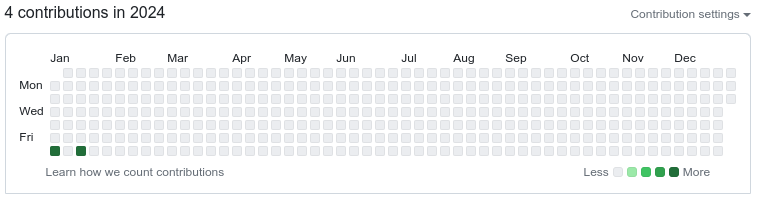
Do you see it?
It’s January 20th and I don’t have many commits in there. I mean, I’m not too bothered about it. I’ve been programming in some other non-public repositories elsewhere.
That’s not it.
Have another look:
Do you see it now? It’s a blank canvas!!! 😄
Wouldn’t it be cool to draw something in there?
That’s the thought that started it all. Inception. I couldn’t get it off my brain. I had to draw something in there.
Some questions came to mind:
- How does GitHub track activity?
- Does git commit history affect activity? It has to be, right?
- How can I test this?
- Can I draw anything I want?
- Can I play with color intensity by doing more/less commits in one day?
- Would something like “Coding is life” fit in there?
And that’s how my Friday’s night 2h journey of fully-focused programming began.
I was sure that I was probably not the first person to come up with this idea. There are millions of programmers in the world. I did not even think about searching internet for something that did this. I just wanted to program it myself from scratch. I just wanted to have some fun.
My journey to draw into GitHub’s contributions page had just begun.
Looking for a clean canvas
My 2024 contributions page had a couple of days with commits already. It was not completely clean. I needed a clean canvas.
I looked back at my GitHub history and I found that 2016 was totally clean. No commits.
This was the canvas I was looking for.
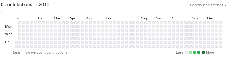
All those empty cells. Isn’t it beautiful? 😊
First things first, how does GitHub draw the contributions?
I stared at the contributions page for a couple of minutes and started thinking about the layout:
- The matrix holds a single year of data
- Left to right we have all weeks of the year
- Top to bottom we have all days of the week
- Days of the week start on Sunday
- First and last columns might have some missing cells
- First cell starts on January 1st, and thus, any year that does not start in Sunday have some missing days
- Due to the first-week shift, there might be years with 52, 53 or even 54 weeks (e.g leap year of 366 days plus 6 days shift in worst-case scenario = 372 days to represent / 7 days per week = 53.1 which means 1 pixel on the 54th row)
I had a clear idea of how I could move forward.
Deciding the language & the data structure
Python was my choice. It is a very easy language to work with, with tons of
libraries and allowed me to iterate fast. Pefromance was not going to be an
issue. Even though I could have used GitPython
library like I did on my
migrate2gitlfs project, I decided to
avoid any non-standard python library. Running git command through subprocess
module was all I needed.
Regarding the data structure. How was I going to represent the canvas?
List of lists?
I first decided to go with a list of lists, where the outer list would represent the weeks and the inner lists would represent the days of the week. A 2D matrix. It would allow me to quickly iterate over weeks and days and read or make any changes easily by just accessing the right index.
I could just “draw” the canvas by just doing something like:
for week in matrix:
  print(week.join(''))
After playing with it for a few minutes, I decided to switch to another representation.
List of strings?
Even though an array of arrays of chars/ints is virtually the same as an array of strings, in python it holds a little bit of less cognitive load to think in one less dimension by using an array of strings; on the other hand, python strings being immutable could be a challenge.
Nevertheless, I decided to proceed as the file’s visual representation was straighforward. I was not concerned about the performance of immutable strings. This was a small project with minimal data.
Let me show you how convenient an array of strings is for visualization:
matrix = [
  '·····················································', # Sun
  '··##··##··###··#·#···#··###···#··##····#···#·###·###·', # Mon
  '·#···#··#·#··#·#·##··#·#······#·#······#···#·#···#···', # Tue
  '·#···#··#·#··#·#·#·#·#·#·##···#··##····#···#·##··##··', # Wed
  '·#···#··#·#··#·#·#··##·#··#···#····#···#···#·#···#···', # Thu
  '··##··##··###··#·#···#··##····#··##····###·#·#···###·', # Fri
  '·····················································', # Sat
]

for week in matrix:
  print(week)
Drawing through git commits
53 columns, 7 rows. I had the matrix I wanted to draw.
Due to the first column containing missing days most of the years, I decided to always leave the first column blank to avoid issues. Same reasoning for the last column.
In order for the characters to have a decent ratio, I decided to focus on the middle 5 rows. That would give me a 5x53 matrix to work with.
Next step was to convert the matrix into git commits. In order to do that I had to find a way to identify the date associated to each of the ‘#’ characters in the matrix.
Given a year, I could iterate all dates and check the day of the week and week of the year for each date and use those as the indexes for the matrix.
Something along the lines of the following pseudo-code:
for date in year:
  week = date.week_of_year
  day = date.day_of_week
  if matrix[week][day] == '#':
    commit(date)
The tricky part here was that GitHub representation starts on Sunday but in python’s datetime package the days of the week start on Monday. The week number might be shifted as well. I needed to write a couple of functions to adjust indexes accordingly.
Easy peasy:
def sundayBasedWeekday(dt):
  """ Let's shift 1 day so we start the week on Sunday's
  """
  return (dt.weekday() + 1) % 7

def sundayBasedWeekNumber(dt):
  # let's shift first week of the year (if needed)
  first_week = int(datetime(dt.year, 1, 1).strftime('%W'))
  return int(dt.strftime('%W')) - first_week
To be honest the day part was easy and I thought about it from the start. Not the weeks. The week number was trickier and I was getting some inconsistent numbers from python, it took me a while to find out I was doing it wrong, but once I did, the fix was straightforward.
Once fixed it was just a matter of iterating through the dates, get the index for each day/week, and perform a commit when the matrix position contained a ‘#’.
For the commit part I used GIT_AUTHOR_DATE and GIT_COMMITTER_DATE env vars. I was not sure on whether author commit date was enough but I did not want to risk it. Again, I was not sure if GitHub was going to cache it all (which seemed very plausible).
That was it. I was done. Right?
Well, shouldn’t I draw things on the console first? Just to doublecheck
The code was there, and I could have certainly executed it, but… how long would it take GitHub to update the contributions page? I had no clue. What if there was a bug? Would rewrites of the history be updated on GitHub’s side? If so, how long would it take?
I had no answer for any of those questions, but GitHub is huge, so there was a pretty damn high chance that it would cache things for a while.
So I decided to go a step further and write some code to check that the commits generated the matrix I was expecting to see.
I would iterate through the commits of given repository and draw the matrix on the console. That way I could test it and see whether the actual representation was correct.
The bulk of the work was already done. I just needed to run git log in order
to get all commit dates in a parseable form, and then, for each of the dates in
a given year, I would set ‘#’ based on the day/week indexes of those dates.
Again, some pseudo-code:
matrix = 7*['·'*53]

for date in commit_dates:
  week = date.week_of_year
  day = date.day_of_week
  matrix[week][day] = '#'
That was good… but another inception moment happened.
At this point I could edit the matrix manually in my source code as a way to draw things and perform the commits. I could see the resulting commits were correct as well.
But wait a minute. I was going to place my code in a public repository later. Maybe other people would use my code later… and manually drawing ascii text is cool already, but…
Wouldn’t it be cooler for it to draw text from a regular text string?
Conceptually the idea was appealing and did not seem complex to implement. I was coding for fun, so, why not?
I just needed to define a submatrix for each of the characters in the alphabet and then create the full matrix from combining them based on the input text.
As long as each of the individual characters had the same height, it would be straightforward. Anything ranging from 3x5 to 5x5 seemed like a good choice for each of the chars.
An alphabet was added. It looked like this:
ALPHABET = {
  'A': [
    '·#·',
    '#·#',
    '###',
    '#·#',
    '#·#',
  ],
  'B': [
    '##·',
    '#·#',
    '##·',
    '#·#',
    '##·',
  ],
  'C': [
    '·##',
    '#··',
    '#··',
    '#··',
    '·##',
  ],
  ...
}
ChatGPT kindly provided me with the first draft. I had to tweak a couple of letters like V or W, but it was definitely a good start and saved me some time.
Once I was done with the implementation of chaining chars together I could draw any message I wanted.
I could run a simple command and see the result in the console:
$ python coding-is-life.py -y 2016 -m "Coding is fun"
-----------------------------------------------------

  ##  ##  ###  # #   #  ###   #  ##   ### # # #   #
 #   #  # #  # # ##  # #      # #     #   # # ##  #
 #   #  # #  # # # # # # ##   #  ##   ##  # # # # #
 #   #  # #  # # #  ## #  #   #   #   #   # # #  ##
  ##  ##  ###  # #   #  ##    # ##    #   ### #   #

-----------------------------------------------------
Here you have an interactive version written in javascript so you can play with it:
Ready to go, right? Well… almost.
Another thought crossed my mind. It turns out I could still take things one step further. Sooo… why not?
Wouldn’t it be nice to draw things in a gradient of intensities?
In theory more commits would mean darker colors in GitHub’s contributions matrix.
I could do more commits as weeks progressed to have a gradient of increasing intensity. It was just a loop over the week number.
After I executed my code a couple of times I checked that commits kind of followed that gradient I was expecting. At that point I realized it would be very easy to do it a reverse gradient as well; moreover it was easy to do gradients in any direction. In order for this to work gradients should be based either on the week number (left to right) or on the day of the week (top to bottom)
So I added the following gradient modes:
- left2right
- right2left
- top2bottom
- bottom2top
From lighter (less commits) to darker (more commits).
Coding is life
Now my code was finally good to go:
$ python coding-is-life.py -y 2016 --commit --gradient left2right -m "coding is life"
Activity canvas to draw:
-----------------------------------------------------

  ##  ##  ###  # #   #  ###   #  ##   #   # ### ###
 #   #  # #  # # ##  # #      # #     #   # #   #
 #   #  # #  # # # # # # ##   #  ##   #   # ##  ##
 #   #  # #  # # #  ## #  #   #   #   #   # #   #
  ##  ##  ###  # #   #  ##    # ##    ### # #   ###

-----------------------------------------------------

Performing git commits...
  Done!

Activity from git commits:
-----------------------------------------------------

  ##  ##  ###  # #   #  ###   #  ##   #   # ### ###
 #   #  # #  # # ##  # #      # #     #   # #   #
 #   #  # #  # # # # # # ##   #  ##   #   # ##  ##
 #   #  # #  # # #  ## #  #   #   #   #   # #   #
  ##  ##  ###  # #   #  ##    # ##    ### # #   ###

-----------------------------------------------------
It took around 17 seconds to generate the 2.6k commits.
Time to push changes to the real world:
$ git remote add origin git@github.com:pausan/coding-is-life.git
$ git push --set-upstream origin master
🥁🥁🥁
🥁🥁🥁
🥁🥁🥁
…. and there we go:
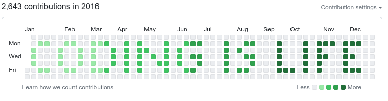
🎉🎉🎉 Success! 🎉🎉🎉 It worked on the first try!! Great!
Here’s the link to my GitHub profile for 2016.
Final notes
It had a lot of fun working on this. I enjoyed every minute of it. Funny enough, it took me less time to build the whole thing than writing this post.
Some hours after running it for the first time I re-ran the script again without gradient to find out how long it takes GitHub to update the contributions page. 24h later it has not been updated yet. I’m still curious… Will see… 🤷♂️
So far I think it was a good call to program the whole thing keeping in mind I wanted to run it once. I’m happy it worked on the first try.
I’m sure somebody with a better artistic sense might be able to draw something nicer. Remember you can always edit the matrix inside the file for a generic ascii art. Feel free to give it a try.
The repository
https://github.com/pausan/coding-is-life
Feel free to clone or fork the repository. Be aware that I might play with it from time to time and I can end up rewriting the whole history again, that’s why I won’t accept pull requests, it will be messy.
Even though it was done in 2024 you’ll see commits date back to 2016, but hey! that’s what happens when you rewrite history on the same repo to draw things on GitHub.
I hope you enjoyed the reading. Have fun!